Candidate Name: Finley Goold Candidate ID Number: 19026270
Curriculum Area: 3DDA
Pathway: JFFA
UALAB Unit: Unit 4 -Consolidating Practice.
Project Title: SHOGO / APOLLO'S SONG
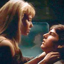
Apollo’s Song by Osamu Tezuka
Project Review
In part 2 I have undergone a lot of change in my design style and what kind of ideas I produce. I went into the JFFA pathway most interested in footwear design, which was a relatively new interest at the time. It was something I hadn’t explored properly before, and researching designers in the area created the idea in my head that it was the path for me. I have realised my tendency to become interested, even obsessed with a new creative area. So I put JFFA as my first choice, rather than fashion, which was what I was initially certain I would specialise in. I have learnt a great deal, things that I wouldn’t have learnt in the fashion pathway. There was a period in which I regretted not choosing the fashion pathway, because I realised that I ultimately want to study fashion (specifically fashion print) as a BA. However I realised that I was happier, and maybe even at an advantage, being in JFFA instead of fashion for foundation. My portfolio was completely different to all the fashion/textiles pathway students. Whether I get accepted onto the course or not, I am happy with the work I did. In making my jewellery/fashion portfolio my design style and desires became a lot clearer, and I realised my natural design process. In the new project I want to exhibit my fashion and jewellery skills, along with my newfound, naturally playful design style.
Project Concept & Description
The initial concept I have come across for this project came from a long graphic novel I found in the library. It is written and illustrated by Osamu Tezuka, the creator of the classic and one of my favourite mangas, “Astroboy”. “Apollo’s Song” is an extremely profound and metaphorical graphic novel, and I was completely captured by the first section, a metaphor for sperm-egg fertilization, and how it is the ultimate mark of love, truth and sincerity between man and woman. The novel is full of deep messages like this, and I instantly fell in love with this in combination with the expressive but sleek illustration style. I felt compelled to derive a concept from the story of the main character, Shogo Chikaishi. He undergoes extreme trials of love, pain and death, all to teach him, a sadistic, troubled and emotionless young man, compassion. This extreme portrayal of a young man learning of love and life, the hard way, is what I want to convey in this project. Ideally I will make something that has elements that represents this aspect of life, possibly in an abstract way. I am expecting to be using garment design methods, like pattern-cutting and sewing. But I would also like to implement jewellery techniques, possibly metal work or woodwork. Although my ideas in this project could stray from the book “Apollo’s song”, I am quite determined to display a clear connection to the novel. I am going to constantly flick through the book, reminding my self of the themes and other aspects of the story. I think I should also research Japan at the time of the manga’s publishing, 1970. This could help me to understand Tezuka’s thinking more. I am aware that there was a big shift in political and cultural matters at this time in Japan, and I think this could be a good point of reference.
Project Evaluation
I want my development to stay relevant to the essence of “Apollo’s Song”. The book is so rich conceptually, with a strong aesthetic, so I think it would create a project that makes sense. What I now know I need to do in the development of a project, is continue in the direction I think is most fun! I work best and most naturally when I have freedom to be playful in my design, so I will try to not restrict myself from being myself, and making the project as personal as possible. My more recent outcomes have been more successful because they really represent my personal interests, and you can see that I had fun in the process. Throughout this final project I will try to make sure that my work is reaching its full potential, which basically corresponds to how much I am enjoying the process. Writing my thoughts is very important to my process. I will make sure I am constantly writing reflections on my work and ideas, because prior to this project I know I had not been doing enough reflective writing. It’s a very helpful way of understanding your own thought process, and I know that it will aid me in making sense of my usual whirlwind of ideas and visions.
Proposed Research Resources and Bibliography (Harvard format)
Tezuka, O., 2007. Apollo's Song. Vertical, Incorporated.Project Action Plan and Timetable:
|
Week |
Date Week beginning |
Activity / What you are intending to do - including independent study |
Resources / What you will need to do it - including access to resources |
|
Week 23
|
Feb 17th
|
Independent Research Week. Intense research and deciding the actual direction of the project. |
Library |
|
Week 24
|
Feb 24th
|
Final Proposal Hand-in Deadline |
|
|
Week 25
|
March 2nd
|
Begin illustrations and designs for my idea. I want to do lots of playful/storytelling illustrations. Maybe I could even make a comic/cartoon strip. |
|
|
Week 26 |
March 9th |
Progress Tutorials
|
|
|
Week 27
|
March 16th |
Refine designs and think about materials. |
|
|
Week 28
|
March 23rd
|
Choose final design and begin making process. Find sources of materials.
|
|
|
Easter Break Week 1 |
March 30th
|
|
Workshops closed |
|
Easter Break Week 2 |
April 6th
|
|
Workshops closed |
|
Week 29
|
April 13th |
Tue 14th Photo Shoot Wed 15th Exhibition Submission Thurs 16th Selected work to be delivered to the Lethaby KX
|
|
|
Week 30
|
April 20th |
22nd Private View 4-9pm |
|
|
Week 31
|
April 29th
|
|
|
|
Week 32
|
May 4th
|
Mon 4th Final Assessment submission All Unit 4 work to be handed in |
|
APOLLO'S SONG by Osamu Tezuka
THOUGHTS - 13TH FEBRUARY
The extreme portrayal of a young man learning of love and life, the hard way, is what I think I want to convey in this project. Ideally I will create elements that represents this aspect of life, possibly in an abstract way. I think the character of Shogo is a good reference point to use, because of the development of his morals and the depth of the meaning behind everything he experiences.
THOUGHTS - 14TH FEBRUARY
I want there to be an aspect of relatability in this project. The character of Shogo, and the things he goes through in 'Apollo's Song', are symbolic of the way humans love and live. I think there is a way of interpreting this, and creating a design project around it, that could convey the pain and suffering, but also the wonder and rush of love. I came to relate and sympathise with Shogo, even though I despised him in the beginning.
I am finding it difficult deciding whether there is too much going on in this idea to construct a design process from. I really like the idea of using the character Shogo as a direct reference, taking parts of his personality and journey, and interpreting them as design. But I also don't know if I should just take the fundamental concepts and themes that I have extracted and continue with them. I do think that the book, and its illustration, is the initial thing that excited me so it would probably be the more engaging option, using the character from the book. Maybe by looking deeper into each thing that happens to him along the way, I will create a picture of how I can represent the morals of the Manga.
JAPAN IN THE 70s
I read that Tezuka based Shogo's character on the Japanese youth at the time, 1970. There was a huge cultural and economic shift between 1968-82. His chaotic nature is quite clearly a nod to the political activism and rebellion against the establishment in this era. One could see that Japan was looking to the future, with introduction of new technology and systems. Later in the 70s there was also a renewed interest among magazine publishers to focus on youth culture. This shift that caused urban youth culture to flourish in Japan is very interesting to me, probably many of my favourite designers are Japanese and would have been growing up in this period. Its interesting to learn what must have heavily influenced them, causing designers like Kansai Yamamoto, Issey Miyake, Rei Kawakubo, Yohji Yamamoto and Junya Watanabe to shift fashion like they did.
SUKEBAN
Sukeban is a Japanese slang word for delinquent girl gangs or more specificaly the "boss girl" of the gang. A culture of violent schoolgirls rose in the 70s; ruthless brawlers in cute outfits, street gangsters which were suddenly in the public eye. People were fascinated and the gangs became an obsession of not just the news but also film-makers and authors. The Sukeban character type is still an ingredient of Manga and Anime today. For example I just watched a 90s anime called 'Ocean Waves', wherein there are lots of rebellious schoolgirls that disrupt the system, bringing the focus of the film on them. I am really interested by this sub-culture, and how, in post-war Japan, there was such a huge uprising of different kinds of youth culture, that impacted the Japanese media and society permanently.
Learning more about the actual cultural shift going on at the time of Tezuka writing 'Apollo's Song', helps me understand his motivation to portray Shogo Chikaishi in such a way. The extreme reflection of the rebellious youth movement in his character is quite evident, making me only want to develop an idea based on this more. The book must have been quite impactful on the youth at the time, and I can imagine that angsty Japanese teenagers would have built a connection with Shogo, as I did. I think this direction of youth and their struggles is good for me to follow and research further, because it is helping me to paint a better picture of what I want to convey in my piece
MINDMAP
I think I need to find a way of turning the portrayal of Shogo into a concise idea that can be translated into a visually expressive project. It is important that I find a strong way of conveying my idea and concept through materials and composition on the body.
MARIKO MORI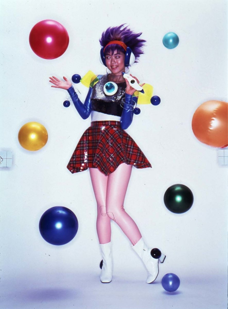
BIRTH OF A STAR 1995
Mariko Mori, the Japanese artist, usually explores the idea of rebirth and reincarnation, transforming herself into a futuristic, extreme version of herself. I was instantly drawn to the fantastical style she uses, fusing technology, religion and culture. Her work in the 90s focused on manga and cyber-cultural phenomena, as a way of Mori questioning the intersection between life, death, the cosmos and technology. Mori is able to achieve synergies between separate cultures and, and even weave together theoretical physics with Buddhist philosophy. I think, in doing this, she causes the viewer to forget about social constructs that separate different parts of life. In her work I see a unity between cultures that I wouldn't usually see, in a futuristic style, that creates a kind of optimism about the future.
Birth of a Star
This photographer, from 1995, depicts Mori herself, as a teen rocker wearing futuristic garb. Self-representation is a strong theme in her oeuvre, wherein she abstracts and exaggerates herself. It is like she is proclaiming her own fame and ascendency as a prominent creative figure in the 1990s. The photo causes the viewer to create a crazy, unnatural and unrealistic idea of Mori, when she is just an ordinary woman. I think this probably came from a place of wanting to escape or transcend the world we live in. Just by dressing up and taking a photo, Mori can become someone from the future, or from another world. I am interested in the way Mori used clothes and adornment to creates a completely new character of herself. This goes back to my idea of youth rebellion and frustration with the world, because many people dress up or make themselves look a certain way, to rebel and express. This idea of altering your physical appearance, to express your feelings or desires, is kind of the general, umbrella idea of which direction I want to move in this project.
OTTOLINGER by Christa Bosch and Cosima Gadient
One of my most recent inspirations is the house of 'Ottolinger', womenswear designers who's work connects with me, and kind of embodies the fashion design aesthetic I am most interested in , especially in womenswear. The design duo, Bosch and Gadient, have, in only 3 years, established an style that is a perfect balance of grunge, fantasy and sexiness. This forms an aesthetic that I think is very intriguing, and creates a narrative and character around each look. These design intentions align with mine when I design a piece. I think about how it can make the wearer feel apart of a story, or fit into a certain character. I will incorporate this idea into this project, possibly with the intention of making the wearer connect to the character of Shogo, in a conceptual way. This could be through the use of materials, or how it is worn on the body.
The two looks pictured above were ones that I thought displayed Ottolinger's style effectively. The one on the left displays their very interesting way of using fabric compositions on the body. The mismatched nature of this look creates a narrative around why this girl is wearing each of the pieces. I immediately saw this outfit and the model as an individual character. I think the model choice was superb, as she fits the style of the pieces very well. The fit on the right is a good example of Ottolinger's manipulation of materials. In an interview Bosch says that she likes burning clothes because its an uncontrollable, natural way of creating the shape of a garment. It also creates a strong narrative around the garment, begging the question "what did the character go through for the clothes to end up like that".
These bags that Ottolinger pairs with their looks are interesting to me because of their craft and aesthetic style. They look really raw and organic, which makes me think that the characters have made them themselves. They are composed of ceramic and plastic chains, which make them look personal, like the maker has used things they had in their house to make them. The playful combination of materials and craft is something oi want to implement in my project because I have been thinking about how using lots of different materials and garment styles can represent Shogo. Each different material/style can represent different parts of love/life/death.
JEREMY SCOTT WINGED JEANS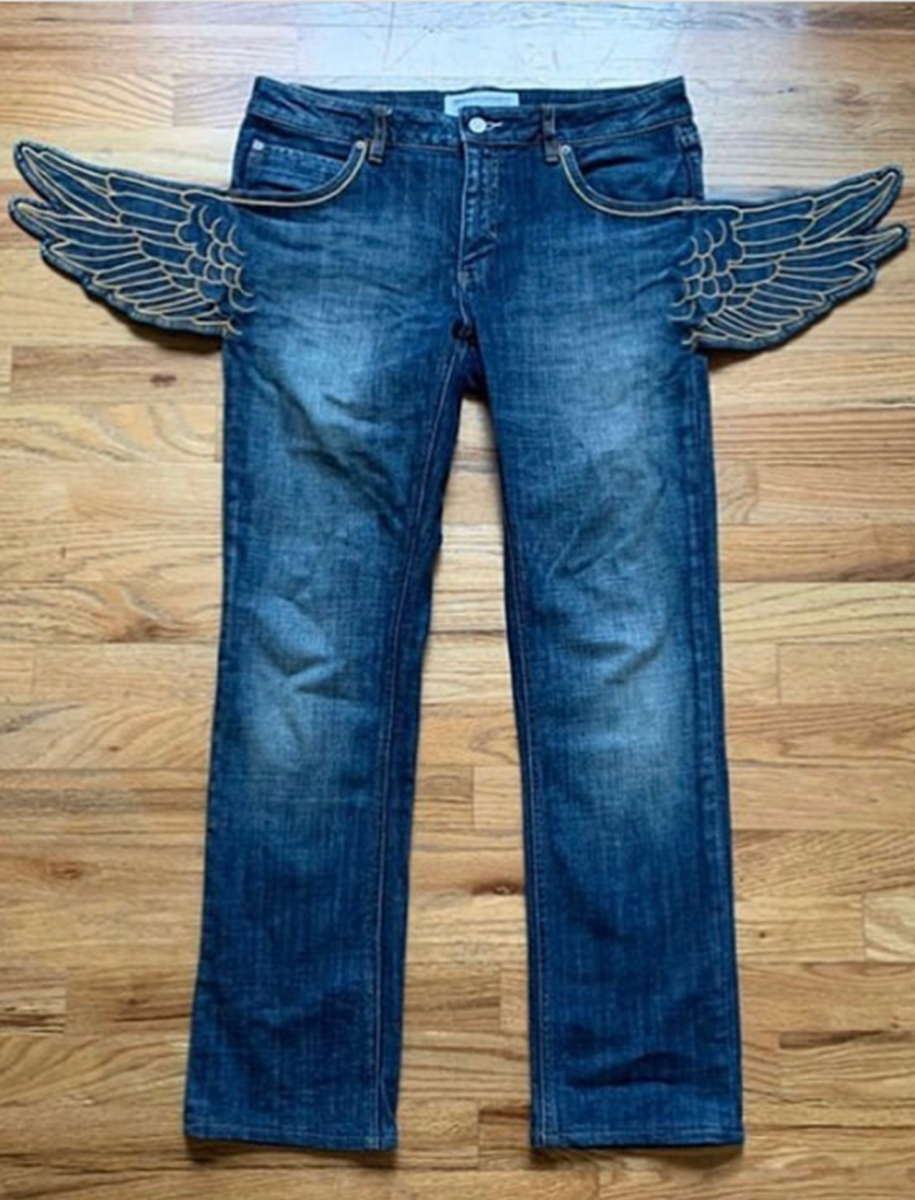
I saw these jeans on instagram and was instantly in love with them. I loved how they didn't alter the shape of the classic jean, but also the silhouette is completely elevated by the addition of the wings at the waist. This playful alteration is so effective because it basically allows a pretty basic garment to be a transformative piece. You could wear them with other basic garments and it would give the outfit a playful flare. This way of turning an ordinary piece into something playful and costume-like is the kind of aesthetic I like, and I think I could do something similar in my project.
CROCHET UNDERCOVER book
I was looking in the knit section of the library for a style of knitting/crochet that I could think about using in my piece. Since I am thinking about using lots of different techniques, or mismatched materials/styles (for conceptual reasons) I thought it was appropriate to consider knitting and crochet processes. I was also interested in them because I haven't used this process yet in foundation. This book stood out to me because it has playful designs that reminded me of my childhood. The kids' hats are playful and let them pretend to be whatever they want. I think this style of playful, childish knitwear is something I could incorporate into my process. This more childish side could represent Shogo's immaturity and childhood.
WALTER VAN BEIRENDONCK SS18 MENSWEAR
I was watching this runway show on youtube, just because Walter is my favourite designer, and the first look shown above intrigued me a lot. The way the vibrant print jumpsuit is covered by the brown overcoat really intrigues you as to what the story is of the print underneath. In the show this was the first look where any print like this was introduced, which made me wonder if Van Beirendonck intended the print theme in the collection to represent something; a shift or development. To me Walter is a master at using print. They always create a completely unique narrative, for example in this collection there is a sporty, active style in the print. Some of it reminds me of cyclist gear, with a playful twist. I have alway wanted to produce prints like this for clothing/accessories, and I think it could be useful in this project to represent certain emotions/themes. This could be using colour and shapes to evoke feelings in the viewer.
CRAIG GREEN FW20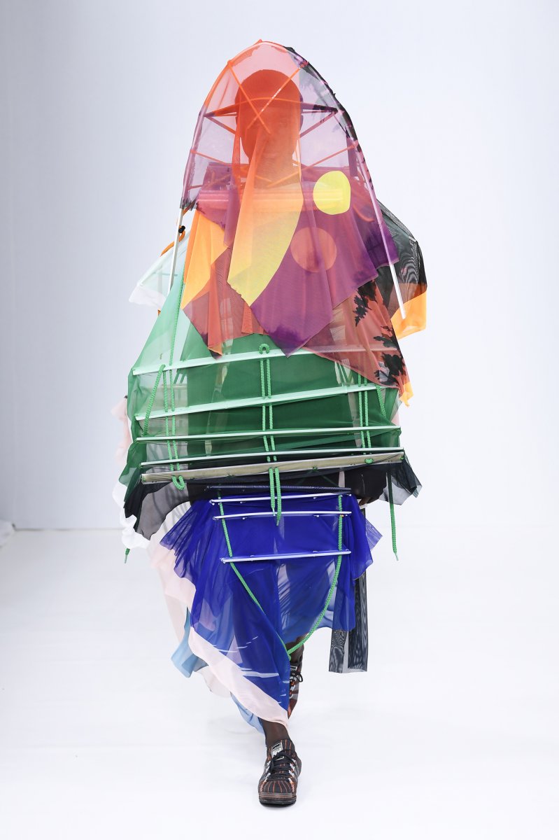
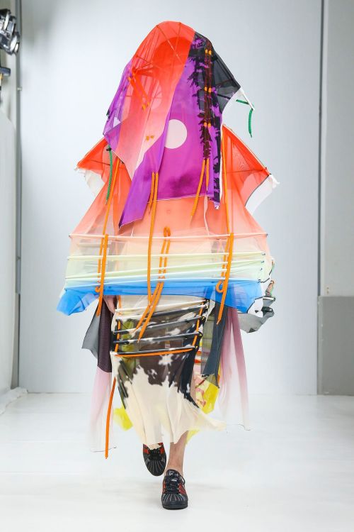
I remembered how much this recent collection by Craig Green impacted me, and thought how these specific looks related to the some ideas I have for this project. The use of colour and structure on these looks is so effective in transforming the body into something visually impactful. Lots of his work has emotional themes weaved into the designs. At a first glance some of it could just look like exaggerated workwear, but in the DNA of it there is Craig Green's interpretation of emotional baggage carried by boys and men. It's about the feelings that we as males, silently carry on our shoulders through life. Green so deftly implants his personal, emotional ideas into his work, but when watching the show the emotions come through incredibly powerfully. I definitely understood and was affected by his most recent collection FW20, on an emotional level. The last 4 looks are like the climax of the collection, and I think it was like a final release of emotion for Craig. The use of colour and more fluid structure in these looks feels like a final outburst of emotion for Green and his audience.
SKYRIM DRAGON 3D DESIGN
I stumbled one one of these images on instagram and it inspired me to broaden the type of design I was looking into. A 3D game software designer posted his original drawings and final image of a dragon for the video game 'Skyrim' and it brought me emotion in a completely different way than the other things I have been inspired by. The harsh, violent imagery of the dragon caused me to realise I needed to also research areas that are completely different to the playful, vibrant work, to find references for the painful, cold part of love/life. I instantly thought that this kind of aesthetic was something I could use in the parts of the piece that may represent the harsher aspects of love, and things that Shogo goes through.
DORAEMON HELMET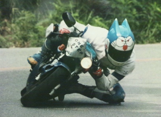
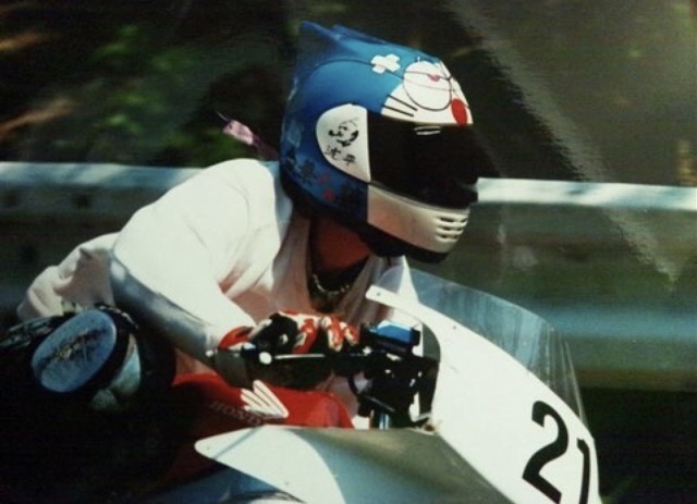
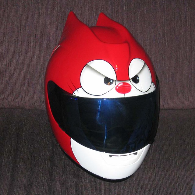
The character Doraemon held a special place in my childhood. I didn't know much about the actual franchise, but I just thought the character was cute. I honestly just thought this picture of a motorcyclist wearing a helmet with Doraemon's face on it looked cool. However I realised that it links to my project, in that it is a fun accessory that people can wear to connect to their more playful side. I think this use of print on this kind of material (hard plastic) is something I could maybe incorporate into a section of my design.
FRANCE-LISE McGURN
I saw these paintings in an open gallery, "Simon Lee gallery", and I thought I should go in and have a look. I was really interested in McGurn's painting style, and how most of the work looks like it comes from a life drawing class. Her lines and colours are so confident and she overlaps different figures to give a slightly abstract composition, without confusing the viewer in any way. The second painting above was my favourite because of the layers and visual story behind it. U can see that it was originally a framed drawing on plain paper. McGurn then used some spray paint or paint to cover it up and create a new surface to paint a portrait on. I loved looking closer and seeing the original drawing underneath. I just love the layers to this piece and how it made me question why she decided to cover up the original drawing.
BEATRIZ MILHAZES
Milhazes prints and collages are extremely masterful in how she combines shapes and colours. There is a lot of super-position, which is the interplay and emphasis of shapes by overlapping. She uses colours that you wouldn't usually think could synchronise, in such pleasing harmony, that the compositions become extremely visually satisfying, despite them being chaotic in their use of shapes. Milhazes uses motifs inspired by Latin American and European cultures, usually Brazilian according to her own culture. I actually don't like her style all too much, because it feels a bit too whimsical and out of date for some reason. I think it may just remind me of the kind of craft my grandma would try to get me to do when I was younger, which I never liked. However I definitely admire her use of colour and shape to create abstract but concise pieces.
ED TEMPLETON PHOTOGRAPHY
Templeton became drawn to capturing moments like the one above. From a voyeuristic perspective, he photographed young lovers who were consumed by each other and completely unconcerned about their surrounding audience. “The reaction is out of my control,” says Templeton. “I have heard feedback from people who said that it reminded them fondly of their teenage years". This nostalgia of young love is so strong and I can imagine that as an adult it is common to yearn for those days, when love was so pure. Templeton has also said that a reaction his photographs have gotten is that the viewer feels creepy, watching such an intimate moment between two strangers. I think its interesting how different people react, because it probably reflects their own personal experiences. Most people probably can relate to the pictures.
TRON
TRON is a Sci-Fi film in which real-world humans are transported into a digital realm called 'The Grid'. A young man finds his father, whom went missing years before. Flynn, Sam's father, was obsessed with research into technology, and finally discovers a way to turn his chemical and biological conscious into digital code (I guess binary). He transports himself into a computer and never comes back to his son. 20 years later Sam finds his old office and goes in after him. This translation of their human selves into the digital, video-game world was a revolutionary idea at the time the original film was released. The fantasy of many kids and teens of being in their favourite video game came to life in the film. I think this aspect of the film is something I can relate to this project, because I want to now focus on the idea of youth using fantasy to escape from their life, or more specifically their feelings at the time. It can also be related to the pure wonder and imagination of when you are young. The feeling of love and emotion is so much stronger and more vibrant. I want to use the colourful, bright part of the fantasy and scifi world to show the feelings of love and happiness.
RISKY BUSINESS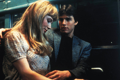
The film risky business is one of best representations of teenage love excitement I have watched. A young call-girl is called by an even younger boy. They have a deep connection and begin to see each other more. The main part of the film that I want to reference is when the two go on the subway and have a mind-blowing moment. The song and the intimacy create a mood of obsession and connection that is what young people yearn for so much, when they have never felt anything like that before. The connection between the two young people is immense, and its one of those moments where nothing else in the world matters to them. They reach a new place which feels more fantastically happy and serene than their real life, at home with their family or friends. This is one of the closest things we can get to reaching a new world, so I want to use this feeling and mood and represent it through fantasy and sci-fi themes and styles.
I need to find a way to display young love in a fantasy/sci-fi setting. In lots of films like this two lovers may come from different backgrounds; clans, classes, even species. I think this kind of situation highlights the intensity and power of love at a young age. The differences between the two people, and their coming together.
ARAGORN AND ARWEN
Relations like this on in 'Lord of the Rings', between Aragorn the human, and Arwen the elf, are ones that resonate with me, and this project. The connection between these two species of people, in this fantastical setting, is the kind of thing I want to portray in my work. They might not be as young or naive as me, but the wonder and emotion shown between them in the course of the films is magnified by the setting and characters around the, in the exact way that I am interested in. I see the costumes and weapons in the film to reflect the dynamic of the two peoples' relationship. I really want to find some way of designing a piece that uses aspects of fantasy and sci-fi to reflect the dynamic of young love.
KYOTO TO CATWALK
This exhibition was perfect for me for 2 reasons. It was all about kimonos and Japanese fashion history, which is probably the culture I am interested in most out of any. Because my mother lived there I have always been influenced by aspects of the culture, like anime and manga, fashion, architecture, theatre and the landscape in general. My mum took me to this exhibition because she knew I would love it and also find inspiration in the exhibits. It was so riveting because it showed the development of Japanese style over centuries. It then went to show the influence of kimono and Japanese garments on the rest of the world, showing work from contemporary designers like McQueen and Galliano. The strong influence of classic Japanese kimono (the word actually translating to 'the thing to wear') on contemporary fashion design is interesting to me, and i enjoy how certain designers take inspiration from the shape of kimono or the type of fabric and pattern used. However, in the exhibition I was more interested in seeing the traditional piece from around the 1700s to the early 1900s.
This was the first kimono that really excited me. I was so interested at how the print, which looks quite untraditional to me, was used on a piece that was dated to approximately 1730s. The use of skeletal motifs creates a dark yet playful kimono. I read that it would have been worn by men of the samurai class, and I liked the image of a strong samurai wearing this kimono.
I liked this one because of the way the designer used such a mundane subject for the print on the kimono. Kimono are traditionally a luxurious extravagant garment, worn to show the wearer's class and wealth. Using this basic print on a plain white fabric, that doesn't look particularly expensive, creates an interesting juxtaposition. The classic idea of a kimono, being a high quality, upper-class thing that people were only allowed to wear if they had prestige or power, is discarded and the kimono is emblazoned with a basic, non-flashy print. I love this method of taking a traditional garment and changing the idea and purpose of it.
I
This was my favourite Kimono design in the exhibition. It was in the later section where contemporary kimono or kimono-inspired designs were shown. The vibrant ensemble, by Ishikawa Narutoshi, is a pretty classic design in terms of shape, but the vivid colours, imaginative patterns and unusual materials take it to a modern, even futuristic level. The Digital prints of sea creatures and organisms is completely out of the realm of traditional kimono craft. I love how this removes the seriousness and austerity connected to the history of kimono, and makes this piece a more fun, imaginative take on the typically more refined and classical art of kimono. Although many old kimonos have playful patterns and colours, this kimono is more on the fantastical and bizarre side, using imagery that would never be found on any old kimono designs.
These kimono designs, from 1920-50, were ones that I loved for their childishness and vibrancy. They instantly reminded me of drawings from Japanese kids books my mum used to read to me. The illustrations on the designs have such strong personality and I like to think they reflect the personality of the village or town in the illustration. The story in the print is so nice and I like how its so much more childish and playful than other kimono prints. I would love to see how the print would look on an actual kimono in real life.
XANDER ZHOU
I came across these trousers, by Xander Zhou, on instagram. The futuristic materials and style of the piece relate the the inspirations I have been taking from sci-fi like the outfits worn in Iron and the video game Destiny. Zhou executes it so well, creating a smart look that also has credible futuristic aspects. The panelling on the trousers look like they are built for a specific function, which is what makes futuristic design credible. We re-make and update things because we can simplify or add functions, and every part of the trousers looks like it is made in that way for a functional reason. The way Zhou combines tech with sleekness is what makes the outfit so cohesive.
SCI-FI PATTERNS
TRADITIONAL JAPANESE ARMOUR CRAFT
Because I have been thinking about using patchwork and panelling in one of my headpieces, I thought it would be relevant to have a look at Japanese Samurai armour. I have always been inspired by this culture, so I knew that the helmets Samurais wear, often include armour panelling, similar to something i may want to implement in the crafting of one of the headpieces I am going to make. In these two images you can see how lacing is used to connect the panels. I love the handmade but robust look of this, and think i will use something similar in the construction of my headpiece, that is inspired by fantasy creatures and armour. In the second image it is more obvious how the pieces are actually brought together, so I could potentially copy that process when I am actually making my piece.
ORC ARMOUR
CAROL CHRISTIAN POELL JACKET
I came across this leather jacket by Carol Christian Poell. I loved the rugged, worn look of it because of how it looks like it has a rich story, now ingrained in the DNA of the jacket. Although Poell artificially creates this look on his work, it looks genuine and builds a feeling around the piece. I actually think the fact that the worn, pre-loved look being manufactured makes a more interesting piece, because it leads someone to think it has been owned before. It can create an idea in someones head of someone else wearing the piece, even though no one has. I was specifically interested in this jacket because of the way the pieces of leather have been stitched together. The exposed, imperfect stitches along the meeting points of the fabric look they could almost break, causing the whole jacket to fall apart. I like this tension created by such a simple method of construction. The stitching looks like something you would find on an ancient, maybe even medieval era. The handmade, but robust look is what I want to incorporate in my "Orc" headpiece.
BONES
ANNA UDDENBERG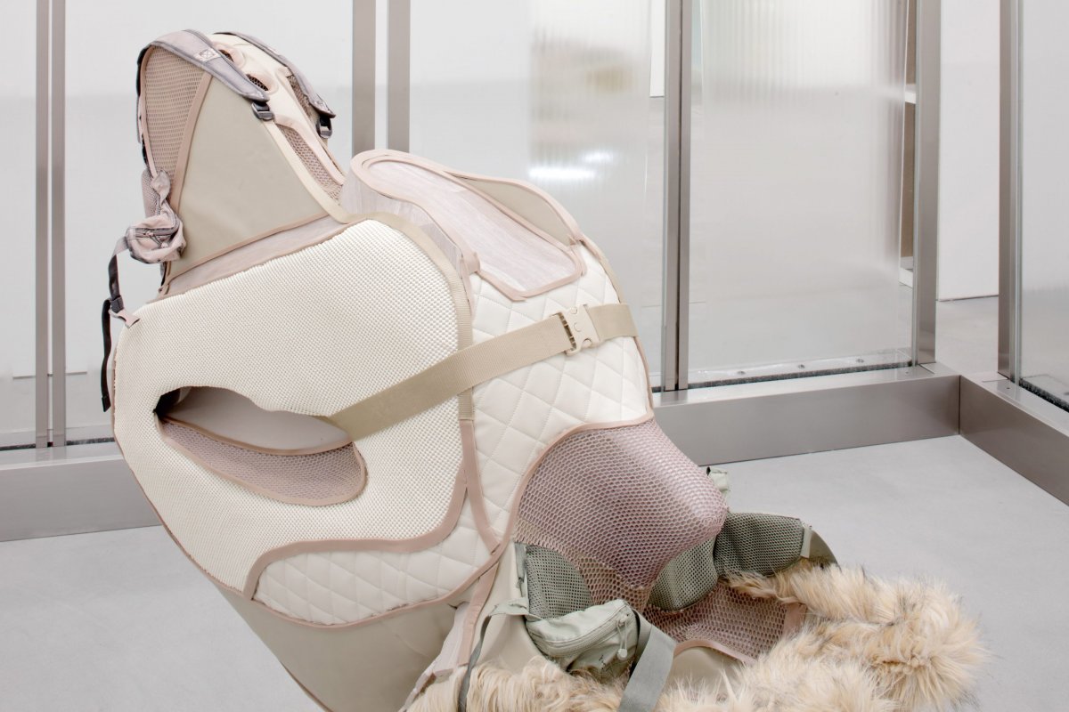
I was previously intrigued by Uddenberg's work, because it fit into the fashion research I was doing at the time. her sculptures that incorporate the female human body featured dynamic and stylised body suits, that looked beautifully and intricately constructed. It was evident that Uddenberg had a background in fashion, which I found out she dumped to pursue fine art (from an interview with Radar magazine). From this article I became fascinated with the connection she makes between fashion design and sculpture, because it aligns with my ideas of fashion and other areas of design. The way she uses shape and material breaks the boundaries of the two disciplines, merging them together. When she plays with the human form, she often manipulates it so that the female body finds itself in uncomfortable or even unfair positions. The stretching and exaggeration, through both the posing and material form, is what Uddenberg employs to force a certain event, behaviour or stereotype to be looked at in a new way. The lady above, straddling a suitcase, precariously yet powerfully, is a good example of her using a mundane object and idea - someone sitting on their suitcase - and transforming it into a spectacle, with unique combinations of materials and dramatic poses.
Uddenberg's use of materials makes me want to think more deeply about how I am going to make the piece. Her use of fur interests me. I don't know if I would want to use it but just the way she uses a variety of textures and colours to make the story of the piece more vibrant inspires me.
MIST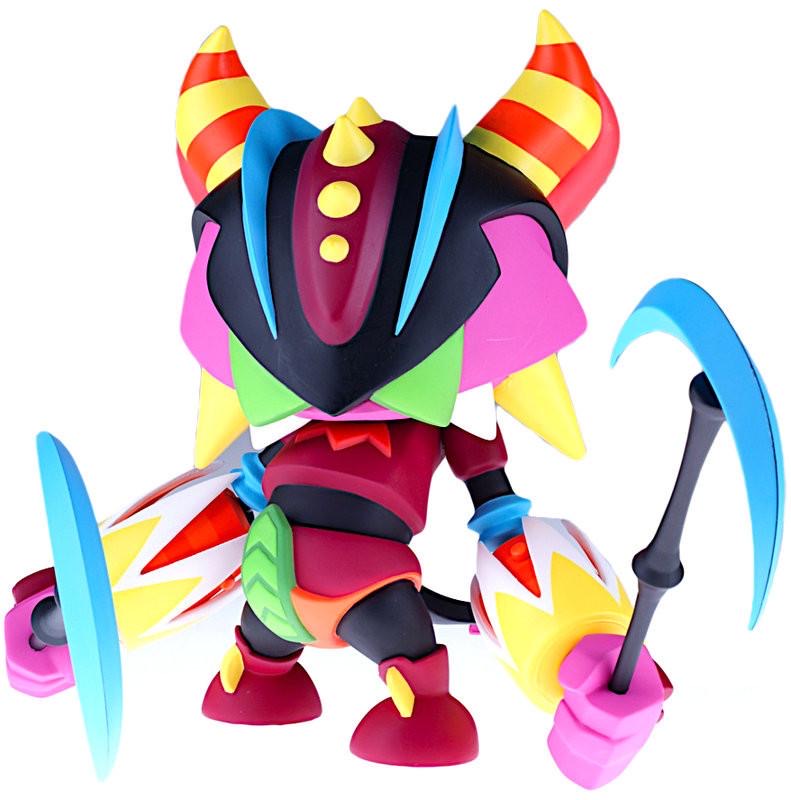
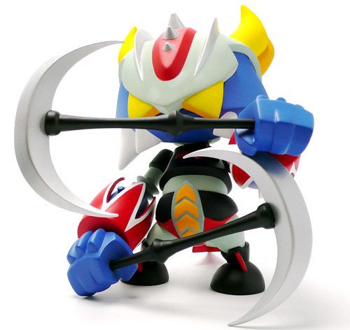
These figures are designed and made by Paris-based artist Mist, who started off in Graffiti, moving into sculpture and painting. The artist creates original designer toy figurines, which I really identify with, and link with this project in an interesting way. The style of the figures above is similar to what I was picturing my outcomes to look like at one point of my project. The animated, vibrant style and shape of the figures connects to my childhood love of characters and toys that have a fantasy, futuristic design.